Greetings from the Critique Club
I'm going to start off by saying no doubt about it you met the challenge well.
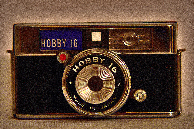
I think the age of the camera warrented black and white and that red dot and blue background on the Hobby 16 logo just don't cut it.
I do agree that the camera is slightly tilted but in some ways that adds a little interest to very plain photo. Yes thats what my issue is with this photo...it actually reminds me of a stock photo for an old camera newspaper ad. Just not appealing in the age of digital.
Anna |









 Add photograph to your favorites
 Add photographer to your favorites

 Photographer found comment helpful.


