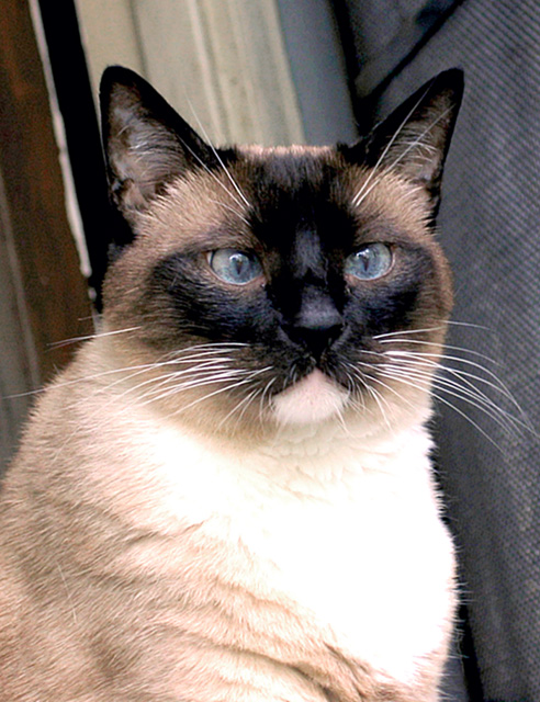
Charlie (age 9) was slightly brain damaged at birth. He is a beautiful and loving cat, but frequently anxious and very easily alarmed.
He is also extremely camera-shy.
I could never have gotten this shot with my SLR --he only allowed the photo shoot because the camera was on a mini-tripod about 4 feet away and the display screen was angled in such a way that that he had no idea I was taking pictures of him.
Statistics
Place: 135 out of 138 Avg (all users): 4.0081 Avg (commenters): 3.9231 Avg (participants): 4.0225 Avg (non-participants): 3.9706 Views since voting: 1265 Votes: 123 Comments: 14 Favorites: 0
interesting cat, but the fur is a bit blown out, and I really don't see how this is off centre. The other colours are nice though, despite the distracting and tilted background.
This is a straightforward shot of a cat, though I'd like to see a bit more interpretation here rather than just a cat: does this cat have anything to say about other cats, for instance, or about pets or animals or eyes? Perhaps playing with lighting levels or directions or various poses of the cat would help?
I'm assuming the eyes are the object here and therefore you meet the challenge, but, to be honest, to me, it's the whole cat that's the subject and it pretty much fills the picture rather than being off-center, especially if I haven't read the title. As for the photo itself, none of the background has any strong colors so it's not too intrusive, but I would prefer to see a cleaner or blurry background, personally. The white fur on Charlie's chest is very much overexposed and overpowers the image. Maybe use something (I often use a bedsheet) to block out / reduce the strong lightsource from the right to even out the lighting ...
Focus is quite soft here. Also, the lighting is really harsh on Charlies chest. The cat's eyes are really not that far off to notice that there is anything wrong with them, and your subject is smack dab in the center of the photo vertically. However, his head is slightly above the horizontal 'center' so this fits the challenge. The background is really distracting. It looks really tilted and the strong diagonals do not go well at all with the vertical cat. I wonder if the harsh lighting was responsible for the bad focus. Sometimes that's what happens.






 Add photograph to your favorites
 Add photographer to your favorites


 Photographer found comment helpful.


