Originaly shot for white on white challenge.
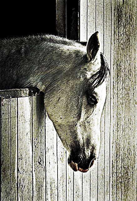
I messed with this shot so much I have no idea what all the steps were. in and out of lab color , copied lightness channel, contrastr up43, brightness down 43, cloned out the stall door, sat up 31, usm @147,7.5,0 then again at 64,50,0, then converted back to rgb mode, posterises a copied layer and squeezed it in levels, created a bunch of copies in layes to use different textures and settings, at this point is all got blurred since I threw everything at this to get a decent level of noise without it getting too blocky.
Statistics
Place: 39 out of 274 Avg (all users): 5.9267 Avg (commenters): 7.6429 Avg (participants): 5.8103 Avg (non-participants): 6.1067 Views since voting: 1466 Views during voting: 358 Votes: 191 Comments: 20 Favorites: 2 (view)
A strong photo. Very pensive. A feeling generated mostly by the subject's head position and expression, the spare composition, and the inherent lack of contrast in the scene. It is accentuated by the processing, including not only the grain, but also the contrast and brightness adjustments. Together, these remove the "realism" from the image, leaving the emotion behind. I don't know (or care) whether the color is natural or artificial, but it is perfect for the mood here. Beautifully done.
The flaws are few and mostly irrelevant. When looking at the photo awhile, a mildly distracting circle pops out in the center (starting in front of the eye, proceeding to the bottom of the head, and up the front of the mane). I think the forehead should just a bit darker. And the title is awful, not matching the photo at all.
Nice shot...iffy title. The high contrast and grittiness are very complementary here to your idea, and I think it is an effective shot. Very painterly...definately more artistic than the shot straight from the camera, I'm sure.
Nice pose of the horse. The eye is very well detailed as is the nose. I thought that the color of the horse and wall were too close, though. Maybe less grain on one or the other would have separated the two better.
I haven't commented on too many works here, I'll make an excepting for you.
This is an outsanding piece of work and I wish you much luck in the contest.
8 - Good use of grain for the Challenge. Criticism; difficult given the coloring of the horse, but perhaps a different 'contrast', also perhaps a little more 'space' to the right, or at the bottom, may have made this better in my opinion.
Very sad, melancholic horse. It is not easy to make grain work for you, but as I realized while casting votes, sometimes it makes a photo look more artistic, not documentary. It is like a prior notice: hey, look for a message, or mood, I'm going to tell you something. And this is why I love a mood of the horse, and it's not important, what are its nutrition preferences.
I happen to love this photo very much! I would have liked to have seen a bit less light on the horses head but this is still very well done and the grain adds to this photo. good luck~10~ :o) ~~Cher~~
Love love love!! I wasn't too sure how I would like photos in this challenge, but this one is awesome! Congrats on the catch and I hope you place well for it!






 Add photograph to your favorites
 Add photographer to your favorites

 Photographer found comment helpful.


