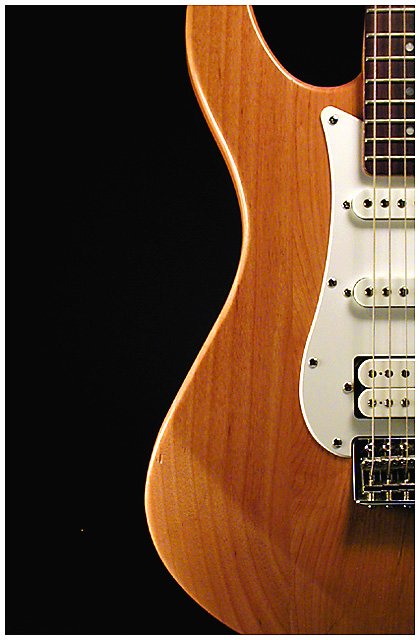
It's a shame most of the people on here can't look past that one little speck on your image. It's super minor and doesn't warrant lowering the score they would have given you (I dont know if any of them took the speck into consideration though). I thought this was a pretty good image deserving of 6.2... The only thing I would alter is the lighting on the guitar itself. Moving the light to cast shadows from the strings,etc would help give it a little more dimension and really give it that extra bump to make this a top 10 shot.
Great job
Great composition, what good placement to create that gorgeous curve of dark and light. I wish the light wasn't spilling directly onto the guitar along the bottom there.
too bad about that little speck on the left. Touch it up for a print. NIce shot. perhaps a little too much USM as you can really see the "jaggies" on your edges.
Holy hot pixel batman! I think showing a little more of the fiddle would've been in your best interests. I share #2 with you. It used to be #1 till I got into photography
Great! I like the curves and the simplicity of it. This is a good example of a shot that could be improved slightly by relaxed editing rules -- I'm sure that one little hot pixel in the bottom left is driving you nuts :)
One of my favourite subjects! Shame about the nick on your guitar to the left of the picture. Lighting is just a tad on the harsh side for my taste, but only just. Very nice cropping, very effective. 9
The background is good, the lighting is great, well cropped. I dont see a flaw in this photo except for that little dot to the left of the lower part of the guitar. 9







 Add photograph to your favorites
 Add photographer to your favorites


