Your first challenge entry with a reasonable score and a few comments. Let's take a deeper look and see where we go.
Technical:
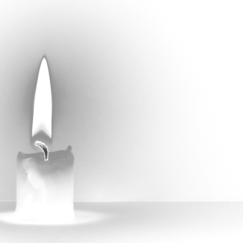
The square format works well as does the lighting. The horizontal line across the photo does not look level, but this could be an optical illusion as I have measure it and it is very slightly out, but not enough to notice. The shot looks like it has been converted to negative, but you have stated that this was caused by using curves. You have cropped too tightly on the candle and removed a section of the shadow which does detract from the overall effect. Next time, less tight cropping and you will note an improvement in both end result and score.
Composition:
As already stated, too tightly cropped. This is a composition fault as well as a technical fault. Other than this, there is not anything else wrong.
Overall:
This photo has potential, but some of it has been killed by the cropping and the negative effect. Yet the negative effect is also what makes the photo stand out. I think what bothers me more about the negative effect is the candle wick, it becomes the focal point of the photo and looks like it was added later. This is just an artifact of the process. I really like the flame and its shadow. Your photo score in the range I would have expected and with less tight cropping would have possibly gone 5+. Good work and I hope to see more of your entries in the future. I hope this is helpful and constructive for you.
Great first entry!! There's something about this shot that really draws me in. For me it's slightly too closely cropped on the left of the candle. Good work!
I had originally put that i felt effects outside basic editing were used... the author of photograph contacted me and confirmed they were not... i stand corrected, but still feel the photo isn't coming across that well for me, sorry....






 Add photograph to your favorites
 Add photographer to your favorites

 Photographer found comment helpful.


