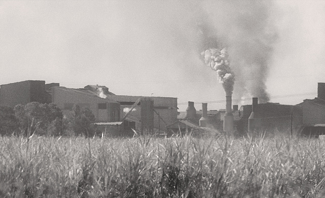
Had there been a bit more contrast I would have scored this higher. As is, it seems kind of flat to me...or maybe if there was more sky or more foreground so that the mill itself wasn't in the "dead" center of the horizon.
u need to add some contrast to this to help it compleete the grayscale and really pop...as it is it is just a wash of grain with and image somewhere bhind it.....really nothing shows through strong enough for there to be a complette composition.
Good framing and composition, although the subject is not so interesting. I think this picture would have benefited from a tonal correction (e.g. levels).






 Add photograph to your favorites
 Add photographer to your favorites


 Photographer found comment helpful.


