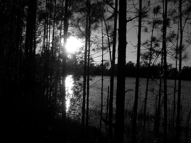
A very nice silhouette but it doesn't quite meet the challenge to me. The lighting is nice and the composition is decent though the horizon seems a bit off-kilter. Focus looks okay. I gave a 3, had it been in another challenge I would have scored it higher.
Weird how this is the exact opposite of the challenge. I'm sorry but it's not even that great a picture. The sun is overexposed, the trees are underexposed and though you have tryed to create an effect of silhouettes here it was useless. I do like your choice of B&W for a landscape but here everything was executed wrong. There's a lack of composition, a lack for a good concrete idea... Needs a little work.
Pro: Nice use of light and shadows, and good vertical lines
Con: Does not fit well into the challenge theme, and the horisontal line could be more straight.





 Add photograph to your favorites
 Add photographer to your favorites


