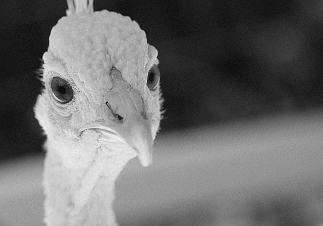
First I have to say, awwwwwwwwwwwwwwww! So cute! I love animal shots so I'm probably not the best person to critique this. But here goes.
First, great overall shot, really well done, the contrast just jumps out at you and catches your attention. Second, the addition of the grain really adds to this shot to a point, I think you could have gotten away with a bit more so it showed up on the bird itself. The lack of grain in that area probably hurt your overall score. That and the lack of black in the shot, I see the white and lots of grays but nothing really black to really make the shot pop.
The lighting is really well done and I like how the face seems to be in just a bit of a shadow, very nice. And the use of negative space on the right really works for me, I love these kinds of shots. A nice use of the rule of thirds though the upper left intersection doesn't land on anything in particular the lines run through the eyes and head drawing you in.
Overall, bravo!!!
Hope my comments help and Good luck in future Challenges!
Fabulous photo! The grain is neither here nor there, but I'm not going to take any points for that. The lighting is just great and the shallow DOF works very well. The simple composition works too, although I wander if including the whole crest would have been even better. 9
Where is the image grain? The background is beyond the DoF and should look that way - out of focus. But if there really was image grain the bird would have it too and I just don't see any. In fact it is pretty crisp and clear.






 Add photograph to your favorites
 Add photographer to your favorites

 Photographer found comment helpful.


