*Critique Club*
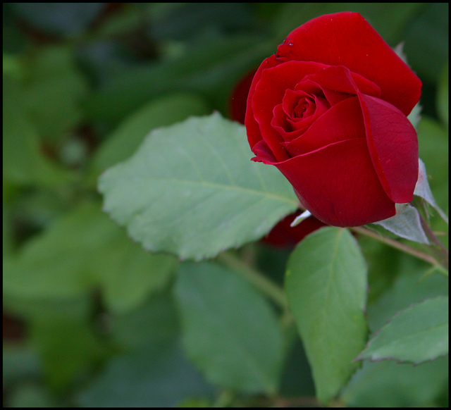
My first thought when I saw this, is exactly what inspzil mentioned. That I wished that the flower itsself were a bit bigger.
I think that if you were to get in a bit closer on the flower that it woudl appeal to me personally a bit better. Someone mentioned that they liked it farther away, to show the environment it was in, and this is true too. Everyone sees things differently, and it's not a suggestoin to change it, but rather my own personal preference.
I do think that the focus is supurb. Great detail is shown in this flower, right down to the veins in the petals.
This looks like a rose bush we have in our yard, that produces these velvety feeling roses. Kind of really soft velvety feel to them.
The color is really good. I wonder though if it had just a tiny touch more lighting if it would have brought the red out even more.
I do like the angle and framing are good. I like how this is in the upper right of the photo. This does make for a visually appealing shot.
Lighting I think could be just a little bit brighter to help bring out some more color in the rose itself.
A really great shot overall.
~Heather~
By putting the rose off center, this greatly enhances the feeling that the rose is part of its environment, and this is enhanced further by the other elements in your photo. So it all comes together for me pretty well here! Nice work!
Nice depth of field here! The overall image seems just a teeny bit dark, but still good. I like the fact that you used nearly the full image size available, too!






 Add photograph to your favorites
 Add photographer to your favorites


 Photographer found comment helpful.
