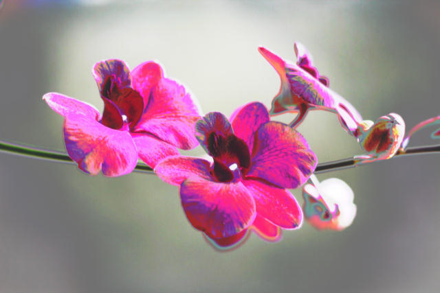
For me, I don't mind seeing some post-editing manipulation, but this seems overly processed. The magenta is blown way out there, but then again, that could be the effect you were going for. I do wonder what the original was like before manipulation.
Not crazy about the oversaturation of color, but I see the point, given the challenge. I think if the background were more of a contrasting color, it'd have more of that Andy Warhol feel to it.
oo very pretty. it seems a little over contrasted, but i still like the colors. there's a little blue line thing at the top left hand corner, it kind of annoys me, but awesome job! good luck






 Add photograph to your favorites
 Add photographer to your favorites


 Photographer found comment helpful.


