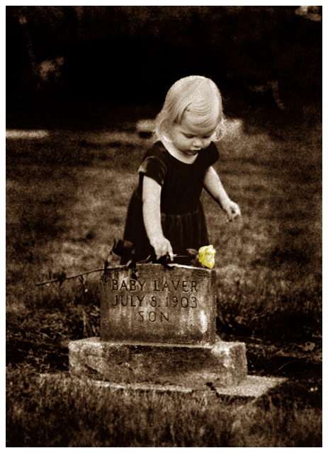
I was looking for something with both a melancholy and an old feel to it. This idea came to me and I dressed my daughter up and zipped down to the oldest cemetery in the county. I searched for a stone which said "baby" and found this one. (I liked the juxtaposition of one baby with the other.) I was worried about Laine's cooperation, but she did just fine. I'd place the rose on the ground 10 feet behind the grave, run into position and then ask her to get it and "put it on the rock". This was I think the second shot I took. It was the best, but unfortunately I had the compensation set for +2/3rd from another shoot so I blew out her arm and hair a bit. Maybe a little push to get me to shoot RAW.
Post-processing: First with a small crop. Then some levels (mild). I converted to B&W by using the channel mixer. It was at least 90% blue channel because that is the "moodiest" of channels and also she was wearing a red dress and I wanted it to look black. Next was some burn around the edges and erasing layer bits to bring the rose color out. A little burning on her hair to save the highlights. A little cloning and dodging around the letters to bring these out. Next I added the grain with Filter>Artistic>Film Grain. I've lost what the exact settings were. (It was close to 6/2/4) Then I duplicated the layer and blurred a bit (gaussian 0.5) and changed the opacity to make the grain a little more "filmlike". Erased some of the grain from her face, hair, rose and words. Finally I resized and added the border.
I went back and forth about sepia and finally added a muted version on about the fifth upload and tweak.
Statistics
Place: 7 out of 274 Avg (all users): 6.5253 Avg (commenters): 8.2143 Avg (participants): 6.4500 Avg (non-participants): 6.6410 Views since voting: 5121 Views during voting: 322 Votes: 198 Comments: 29 Favorites: 10 (view)
Nice shot! The only thing I'd change is to get rid of the rose color - it betrays the "fake" nature of otherwise perfect retro stylization. But this is just my opinion
Quite the shot. Well done. The selective desat is a nice touch. The grain on this adds to a mood that this might have actually been captured in the early 1900s. Good work.
This is very powerful. The grain adds to the mood conveyed by the photo. I might like it even more if it were a little lighter -- but I still really love it, and it's one of my favorites in this challenge! 9
Beautiful - this is one of the rare occasions where I like selective desaturation. Your toning is perfect here, too - this could easily be too heavy of a sepia tone, but for this contrasty of a photograph, it works beautifully. The grain is perfect - you have a very moody, emotive shot here. Well done.






 Add photograph to your favorites
 Add photographer to your favorites

 Photographer found comment helpful.


