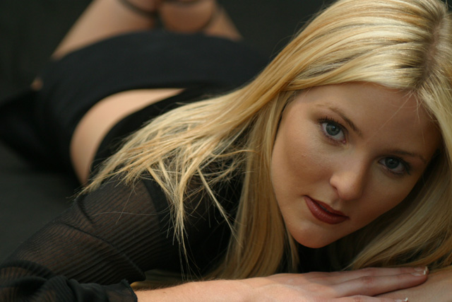
Very beautiful model, first of all. The picture is incredible. My only problem is that I'm not so sure that Vogue is the right magazine for this picture. It just doesn't seem to be Vogues style judging by some of the issues the wife has around the house. However, this is DEFINITELY worthy of a magazine cover somewhere.
Looks like a Vogue cover to me! Pretty model. Well taken photo, with a tiny, personal nit - I'd like to see a little more light on her face, esp. the right side. Very pretty model!!! 9 Rob the Swash
Nice image that could do without the midriff (back) and the legs, they take ones eye away from the main focus of the image. A beautiful image just the same.
I think the cropping required for this shot to work as a magazine cover would really mess with your composition, not that a crop that was just her head would not look nice, but it would be totally different than what you have taken. I like the light on her face, but wish for a greater DOF for this shot to really pop. :)
Very nice model, and I love this shot. I have to comment on the orientation of the photo, however, because if this were cropped to be a magazine cover it would look different.
Im a sucker for a pretty girl, and this gal's gorgeous. Lighting is a little dark on the face, and this style of shot doesnt seem too much like a Vogue cover. I would like to see the crop different so we can get more of her hair/head in the frame.
The face should be the focal point here, but it is in a bit too much shade to draw the eye immediately to it. Maybe another light source or a reflector could have helped here. It also would have removed the shadow on the hand. Pretty model. 6
These types of magazine focus very much on the face, even if the body is shown. And the shots almost always involve more make-up and are usually over-exposed. I'm not saying that to make fun of the 'zines. That's just how those shots are taken. And even though those shots are technically not as good, that's what you should go for if you want to do a "Vogue" shot.
She looks squished. Maybe you need a tighter crop so it looks more intentional that you cut her hands and feet - or a looser crop so she can have some room. the image is lovely
Excellent pose, lovely model. The lighting really makes her skin and hair look nice. Perhaps just a touch more bounced light on the right side of the frame where her face is, and a stronger catchlight in the eyes to really make this cover-worthy (but then, I'm comparing you to Annie Liebowitz... so don't take that as particularly harsh criticism!) Overall very good shot. 8
Take a portrait crop of this - just the face and hand and you would have a winner! The aspect ratio is wrong for a mgazine and the rest of the body is a distraction.
I really like the framing on this shot, although it's not one you usually see on the cover of a magazine. Pretty model. The lighting on her face is a little dark.
The brightness of the midriff detracts from the face of the subject. I'd prefer a l;ittle more light either reflected into that lovely face, or by fill flash. The right side of her face fades into the shadow. Her left eye is almost lost.
good use of shallow dof (although, personally speaking, I'd like to see some shape in the buttocks). A minus is the exposure on the face - it's too dark. The lower back has the colour the face needs. A reflector board would have helped.







 Add photograph to your favorites
 Add photographer to your favorites


 Photographer found comment helpful.


