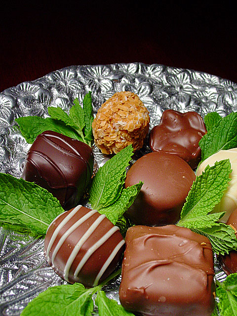
I like the subject matter a lot, but I find the plate a bit distracting. The addition of the mint was a very nice touch. I think a warmer sort of lighting might have avoided the sort of flat look some of the chocolate in the foreground has. :)
Yummmm! Never heard of your mag, but I'm a believer! Very sharp, good color and lighting (no nasty glare spots, even on the silver!!) I really like the sprigs of mint, nice touch. 9 Rob the Swash
The greens look great, the chocolates look delicious. I think the focus is a touch off on the bottom edge, and the silver plate reflects light weirdly.
The brightness of the silver distracts just a bit from the chocolates. I don't know if it's possible to tone it down a touch and still have it look like polished metal. Overall layout and concept are good, as I assume the chocolates were as well.
Oh, yes... this cover would grab any chocolate lover's attention. Excellant composition and high technical quality.The green leaves gives it just the right amount of color.
Nicely formated. As a chef I am familiar with the magazine and is definately thier style. If you tell me you made the chocolate yourself and give me the recipe I might raise your score to 10 ;)
A good idea and attempt. But the pieces of chocolate are not perfect. They would go though thousands of pieces for the cover, wouldn't they? Hmm.. should I mark off for that? I guess not. You probably don't have the time or the money to go through thousands of pieces of chocolate.
This is a very well composed picture. Chocolate and mint go well together and the plate is very fancy. The lighting is a little harsh. DId you get to eat the chocolates when you were done?
nice touch with the mint leaves and nice presentation/camera angle. although, it looks a little sparse for a magazine cover. would be greatly improved with more chocolates.






 Add photograph to your favorites
 Add photographer to your favorites


 Photographer found comment helpful.


