*Critique Club*
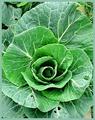
I really like the DOF here, but unfortunately it is so shallow that the soft focus consumes the crisp focus part making it look blurry as well. I think that maybe just a little more of the shot could have been in focus. That would have given us something really sharp to look at.
The lighting is good, no dark spots or annoying bright spots. The colors are really brought out nicely.
I like very much the blurr in the background. You blurred it enough to make it non distracting to the subject. I like how the subject stands out of the background very nicely.
The angle and framing/cropping are just fine. I like how it comes out of the upper left and down into the lower right. This makes for a pleasing composition. I like how the stems are a bit darker than the flowers themselves.
I could see this on the cover of a magazine.
~Heather~
Your magazine title is too vague to truly judge it for challenge purposes, however, the picture is really great. It's lacking just a little more sharpness though.
Personally I do not consider magazines to be in a horizontal shape... thats just me though. I would have used slightly more DOF, although I like the nonexistant background, I think the picture would have looked a tad bit sharper with just a little more DOF... The main part of the picture looks very centered... I think I might have cut out some of the right side of the photo, to make it a better picture.






 Add photograph to your favorites
 Add photographer to your favorites


 Photographer found comment helpful.


