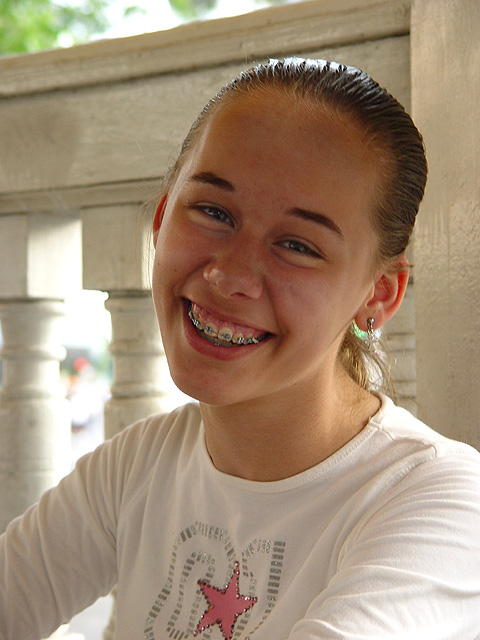
This is a shot featuring none other than my sister, Kelsey. It was a spur of the moment type of shot, only got in 2. She thinks the braces make her looks stupid, but for a shot of a normal 12 year old I think it adds to the picture.
The lighting is natural and a bit dark, but in my opinion nice for a shot like this. No cropping but the levels, brightness, and contrast were adjusted.
Statistics
Place: 155 out of 232 Avg (all users): 4.8950 Avg (commenters): 6.3333 Avg (participants): 4.9431 Avg (non-participants): 4.8435 Views since voting: 1142 Votes: 238 Comments: 12 Favorites: 0
You have chosen a very nice setting. The wooden fence is the finishing touch in the photo. Your model would do well on the front of a magazine although I think that her face is a little underexposed. Maybe flash fill could improve this.
I don't know the magazine but this seems about right for the title. There's space for a logo at top, that's a plus. A little harder would be cover copy because of the brightness of the light coming between the columns but it could be done.





 Add photograph to your favorites
 Add photographer to your favorites


 Photographer found comment helpful.


