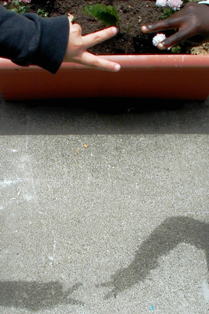
Isaac and Tyra are more experienced models now. The sun was playing hide-and-seek with some pretty thick clouds, but I feel I got enough contrast to make my point.
I would have loved to put the title in a cartoon-like "word-bubble" -- maybe I'll post that version elsewhere.
Statistics
Place: 72 out of 138 Avg (all users): 4.9412 Avg (commenters): 5.8966 Avg (participants): 4.8824 Avg (non-participants): 4.9916 Views since voting: 1846 Votes: 221 Comments: 31 Favorites: 3 (view)
I like the message this picture has, and I like the basic idea behind the set-up. The biggest problem I see with it is the hands and the shadow are too far apart, so you loose impact. also, having the hands at the edge of the planter doesn't seem to help.
I really like your concept on this shot... shadows are all the same :) I'm not sure that I like the flower pot as the backdrop in the top of the photo but I do still like the idea... good work! - jmsetzler
Great idea! I think it could be improved by a little more care with background distraction and foreground background distance, but I think this a really good and original subject.
nice idea but the background ruins it for me and the entire hand should have made it into the picture. Don't you wish we could have do-overs? I know I do!
nice statement of society! I may have tried to compose this so that the hand and shadows were a bit more centered in the photo to draw more attention to them. The dominant view is of the pavement. Nice idea and title.
Wonderful concept, we bleed the same color, too. I usually I like extra "stuff" in the frame that can "add interest", but in this case, I don't think the garden behind the hands work all that well. Photo 9 Creativity 7 Shadows 8 total 8
Fantastic idea...........wow. I like this. Your background is too DARK too see the darker hand on the right, could of been a bit closer to the fingers and centered. Other then that this would of been a winner.
There's more information in this photo than needs to be. Too much background in my opinion. I think this idea would be stronger if the hands and shadow were a bit closer together, vertically, and if shot so only the ground shows as bacground. Change the angle of view essentially.






 Add photograph to your favorites
 Add photographer to your favorites


 Photographer found comment helpful.


