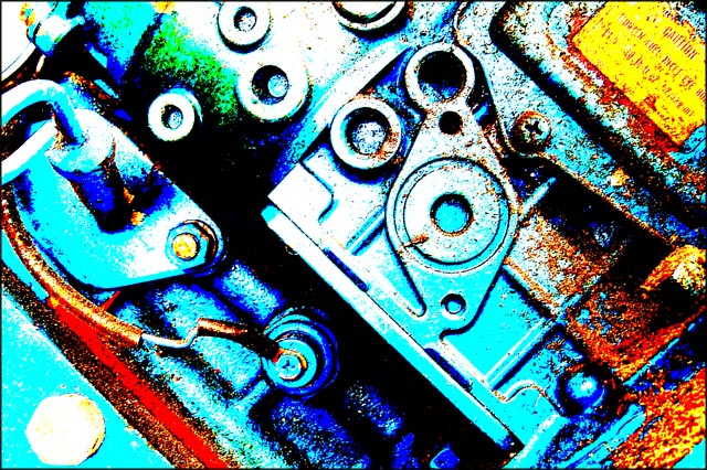
Took this shot of part of my tractor's engine this morning. Used levels, cropped, unsharp mask, and hard mix lighting to increase the graininess...I like it; it has an industrial and abstract feeling...but that's only my opinion!
Statistics
Place: 205 out of 274 Avg (all users): 4.8717 Avg (commenters): 5.6667 Avg (participants): 4.7768 Avg (non-participants): 5.0133 Views since voting: 724 Views during voting: 288 Votes: 187 Comments: 7 Favorites: 0
My intial impression here was YIKES thats bright hand me the sunglasses. Now all joking aside I think you lost a lot of character and charm in your processing. You do have the grain to meet the challenge but the colors are just to bold and become a complete distraction.
I wish the caution label would have actually been readable and again your colors seem to have taken charm from this tractor.







 Add photograph to your favorites
 Add photographer to your favorites

 Photographer found comment helpful.


