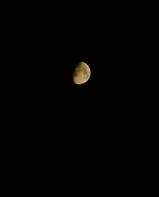
Good photo. Gives the moon an excellent 'isolated' feeling. I think that I would have made the frame narrower. A bit too much space for use as a 'cover' though.
I think you should have tried getting a little closer to the subject :) In all seriousness, I think that there's a little TOO much empty space for a cover shot.
bad composition, your subject is so so far away and for me it does not make me feeling of an cover page. you should crop your shot and fill it with the moon. = 3
Dead center of the page from right to left, not extremely interesting. Doesn't fill the frame at all, or even give us a good clear view of the moon. Nothing much to look at here, but at least you made it vertical.






 Add photograph to your favorites
 Add photographer to your favorites


 Photographer found comment helpful.


