*Critique Club*
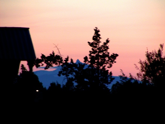
This shot is way too out of focus for my personal taste. I'm not really sure what magazine would put a shot which is so blurry on the front cover. I can't say that I've ever heard of your title as the name of a magazine, but anything is possible.
I think that the angle and framing/cropping are ok. I'm not really sure what that white dot near the left of the photo is, but it is quite distracting to the image as a whole.
I like the color, although it seems a bit muted, like it was foggy or something.
Your sillhouettes are good. I like how they are black, and the background mountain and clouds are blueish. That makes them stand out nicely and not blend in with everything.
Overall composition is good, but too blurry for me.
~Heather~
*Final Hours Critique*
If my comment is brief, it's because the Magazine Cover shots are going to be taken off the CC list tonight at midnight, and I can get to more of them, using less words. Figured even a brief comment is better than no comment at all.
If this image had been sharper, it would be beautiful, but the soft focus makes it hard to determine what I'm looking at. Also, the title does not indicate what magazine you would want this to be on the cover.
The tones and colors here are inviting, especially with the sillhouette. It seems quite out of focus, though, which detracts from its appeal to me. I'm also not quite sure what all I'm looking at.
The silhouettes would be a nice effect - you have it set up to be very powerful, as far as how you framed the image, but everything's blurred. Was this a slow exposure? The smudging of edges is something I see on my slow exposures when I move a bit. It really detracts from the image, making it strain the eye a bit to look at it, unfortunately.
Nice colors, but the trees seem pretty blurry. The title doesn't seem to be a magazine title, what mag were you "covering"? I just don't get it, sorry, my bad.
4 Rob the Swash






 Add photograph to your favorites
 Add photographer to your favorites


