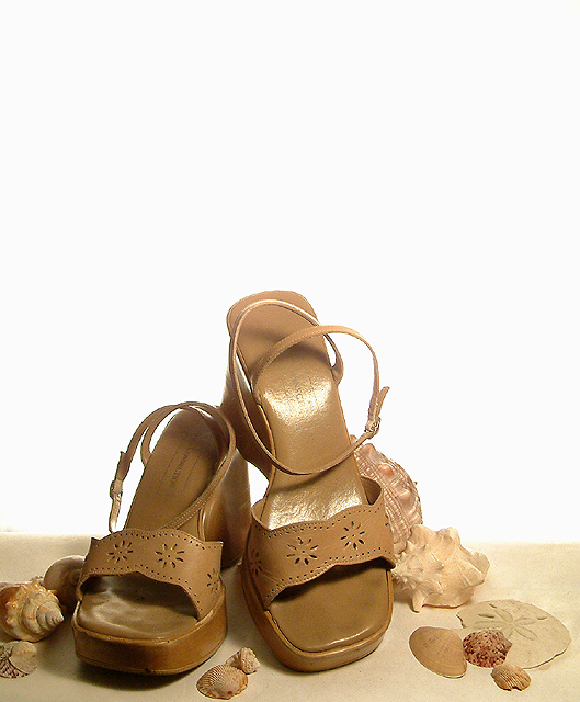
Just my favourite summer sandals (you can see the wear and tear on them) and some old shells to create a simple composition for a fashion magazine.
This is my first attempt at using my 602 and at at really trying to control some studio lighting. I'm not entirely happy with the result, but I did learn a lot. I didn't quite figure out how to get the surface the shoes were on to be whited out, but I did figure out how to do it with the background using a 500w halogen light pointed AT my background.
Post processing:
small crop to make the composition a little smaller
curves to get the background just a bit whiter
brightness/contrast to get more contrast from the shot after the curves adjustment
tiny bit of hues to correct the tungsten light orange cast from the light I was using to light the shoes
sharpen
Statistics
Place: 88 out of 232 Avg (all users): 5.6157 Avg (commenters): 7.2143 Avg (participants): 5.4696 Avg (non-participants): 5.7632 Views since voting: 1655 Votes: 229 Comments: 15 Favorites: 1 (view)
I like this shot because the background is well lit, the almost-high-key works well too. I like the inclusion of the shells to give the shot something 'extra' nice job!
Nice composition, good use of white space and love the use of all similar colour objects. Lighting a little harsh on one sandal and shadowed on other. Could do with just a touch more space below toe at left of image - more sand. Even with magazine title and other text this would still retain that negative space feel. 8
I like this a lot... I love your use of negative space... I think it really works well. The transition from the sandy look on the bottom to the white is also very nice. Why did you choose to use shells in this photo? I don't think that these are the kind of sandals you would wear the the beach are they? I guess it's kind of a very interesting statement about how far people will go for fashion Ex. wearing these sandals to the beach. Your lighting is somewhat bothersome on the higher sandal... but not horrible, more bothersome is the dirt or whatever on the other sandal, though I suppose if they used this for a magazine cover people wouldn't be so anal about using some sort of cleaning up tool. Anyway.. I think this is kinda neat, I like the overall effect.
Nice composition. There's a LOT of free space for type though. Perhaps the background could have been a bit more graduated, rather than blown out all the way down.
lot of sea shells there around the subject one shoe has some hot spots in it maybe different lighting would have been better details are there even the toe prints.
With a setup like this, a blue backdrop would have been preferable to more closely mimic the beach setting. I'll assume your magazine exists; as a fashion magazine this is a reasonable setup. I don't know but that they might have chosen a more contrasting shoe colour and worked the text around it, though this way makes it easier for the copy compositor, certainly. Lots of space up top for copy, too.







 Add photograph to your favorites
 Add photographer to your favorites


 Photographer found comment helpful.


