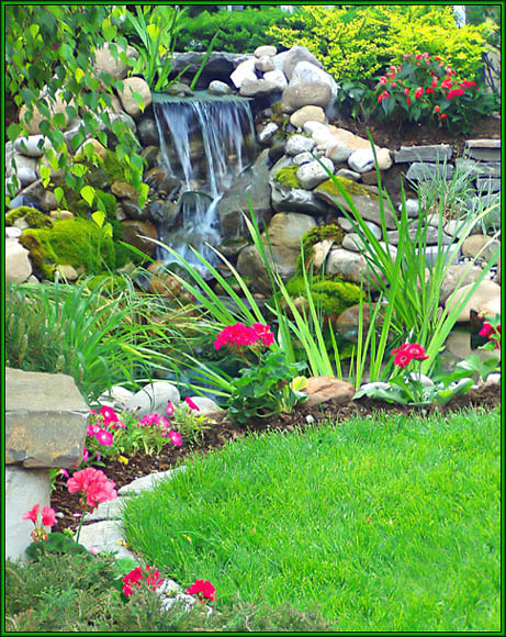
Pretty garden. Love the little waterfall. The flowers seem "too bright", maybe a bit oversaturated, which might account for their lack of definition, whereas the rest of the pic seems nicely sharp. Strong visual impact. 9 Rob the Swash
Nicely taken, nice curves at the edge of the lawn and framing from the leaves. Not an overly exciting Wow! shot but probably suitable for this kind of magazine.
What a gorgeous yard. :) Composition is perfect and the bright, vibrant colors just jump right off my screen. About the only thing that could be improved is the sharpness. But, it is still a very pretty picture as is, good work.
Now, that's a lovely little area, and I'd love to have a yard like that. But that aside, you photographed it beautifully - the grassy area at the bottom is enough to rest the eyes without overwhelming the rest of the picture, and the eye flows naturally down the waterfall and around the plantings at the edge of the grass.
This looks like a great accompaniament to an article within the magazine, but when I try to picture the name of the magazine across the photo, I'm afraid you would lose too much of the detail and beauty of the colors. Perhaps different cropping might have made it more suitable for the cover. I love the colors.
Nice! Good use on the slower shutter speed for the waterfall. Very pretty, I could definitely see this as a cover. Not sure about the green border? Does Better Homes and Gardens use a border? but the rest is very well done.







 Add photograph to your favorites
 Add photographer to your favorites

 Photographer found comment helpful.


