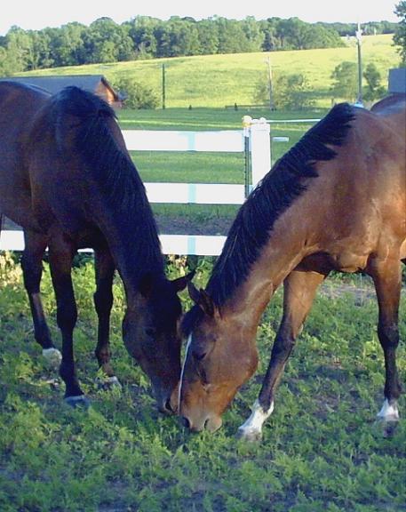
I like the symmetrical composition, but the graininess seems out of place, as does the blueish and white cast over the whole scene. Did you try to play with levels to sort that out in post processing?
The color on this and the graininess aren't very good... I like the two horses and where you put them in the photo, but I think it could have been improved. Good job leaving space at the top for type. I would have played with Photoshop or similar program on this.
Lighting conditions for this shot were not ideal. I think that the colors seem muted. there really isn't any detail in the darker horse at all, the sky is blown out and the fence is really quite too bright. The angle and framing/cropping of the horses is good though, I would have cropped out the icky sky. focus seems a bit soft as well. we can't really see the eyes of the horses.
Nice natural light, and a good shot. The quality looks a little bit choppy in some places - maybe if you made the pic a little bit smaller, the resolution would be better. Good stuff.





 Add photograph to your favorites
 Add photographer to your favorites


 Photographer found comment helpful.


