First - this is a stunning image! How can I critique something so beautiful!
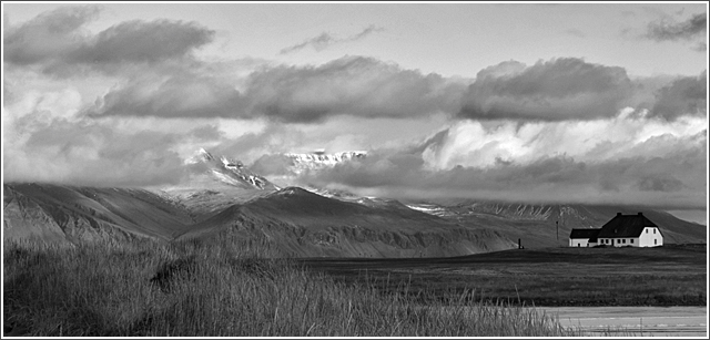
Composition/perspective - the distance relationship, front to back, in this image is excellent. The small hint of higher mountains in the background is real nice and adds to the overall expansive feeling of the shot. The grasses in the forground, to me, almost act as a leading line drawing you to the horizon on the left which then sweeps you right across the image to the object I see as your subject - the house. Placement of the house and it being the only one in the shot help to create the mood of the shot quite nicely. Your timing of the shot was quite good - the clouds almost seem as though you placed them there on purpose. The image is crisp and very clean. Black and white was the perfect choice for this although I think it could be just as strong if in color. The crop also adds to the quality of the image.
Color - well, it is b/w. However, you have processed it to maximize the various shades of gray quite nicely. For a black and white image this has a very rich palette.
Lighting - natural of course...the sky is where I would look for problems here and I see none. Even all the way to the back where you would expect more blending, you got the exposure just right to allow all the elements and details stay in the image.
Challenge requirements - the crop helps to add to the 'wide angle' aspect of the shot, but even a taller crop would not have hurt it. Following the horizon across the image in either direction you can feel yourself travelling the distance. It definitely meets the challenge requirements.
Overall/my opinion - I was a little intimidated by critiquing this shot. It is exactly the kind of shot I strive to be able to produce. Your talented eye is very apparent in this image and your control of the conditions around you with your camera is clearly evident. VERY WELL DONE!
I wish this wasn't black and white, especially if there were some bright yellows and reds in here. I think it could have had even more visual impact if it were in color.
Very, very, very nice! I like it a lot. The grasses in the foreground, the clouds, the dappled light on the mountainsides, and the house with its little black windows. Great photo. And if anyone comments that the house should be positioned more to the left to comply with the rule of thirds, I will personally kick their ass ;)
Love the building. It gives it some architecture and contrast with the white building and dark roof. Next time, use the maximum 640 pixels allowed, so that the image can be larger.






 Add photograph to your favorites
 Add photographer to your favorites

 Photographer found comment helpful.


