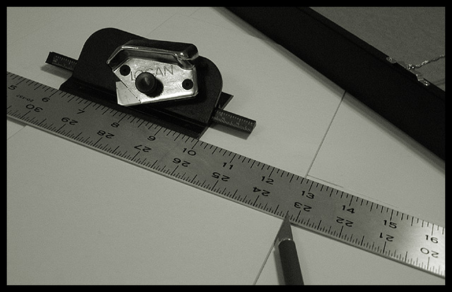
This is too hard on the eye to make a sucessful mag cover. Perhaps show a finished photo with the matting around it and the cut off strips with the tools laying to the side.... but the tools alone are too 'ugly'....
I like the diagonals in this shot. Focus and clarity are really doo as well. Nice crisp numbers on the ruler. Lighting is ok. No bad glares, but I wish that the shadow on the diagonal object in the upper right were a bit more subtle. Overall nice shot though.
I like the idea, and black and white was a good choice. I think the picture overall would benefit from maybe a little brighter lighting and a little more contrast. Still, a nice picture as is.
Personally I do not consider magazines to be in a horizontal shape... thats just me though. Is the matte board grey, or should you have increased the contrast some? I guess I could see this on the said magazine... I think it depends on how high-tech the magazine gets. Technically it's a very good photo... I guess I would have liked to have seen it as a vertical instead of a horizontal, I think it would have improved it as a magazine cover, and probably improved your score as well.






 Add photograph to your favorites
 Add photographer to your favorites


 Photographer found comment helpful.


