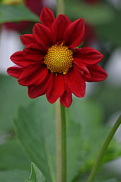
I took this in my front yard with a Sigma 70-300mm lens at 300mm, and a tripod. This is one of my first pictures with my new 10d. It's probably obvious I don't totally know what I'm doing yet, but I'll get there.
Statistics
Place: 79 out of 232 Avg (all users): 5.6831 Avg (commenters): 6.2353 Avg (participants): 5.6917 Avg (non-participants): 5.6748 Views since voting: 1229 Votes: 243 Comments: 17 Favorites: 0
C'mon, Martha Stuart Living would have handcuffs on the cover...ok ok bad mav bad. Really, I love the DoF and the color/detail is exceptional. I like how the edges of the flower pop off the page.
Hmmm... usually I dont likea composition where the flower sits smack dab in the center, but this one is kind of interesting. However, Im kind of bothered by the fack that I cant really see the stalk for the flower, too blurry.
Awesome shot but there's a noticable outline around the flower. And shouldn't "Martha Stewart Living" show her doctoring her stock transactions instead? :D :D :D
Slightly more vague than I might have invisioned on a Martha Stewart cover but not out of the question by any means. (By 'vague' I mean the cover art tends to focus on, say, a whole flowerbed or a project involving flowers more than it would a single bloom but that's on limited experience, I admit.)
I like the shot a lot. It's got great colour contrast, and the focal blur in the back makes the ideal backdrop for coverlines. The only place it suffers at all is fitting the logo at the top without obscuring the flower, which is minor; they might choose to continue the green colour up into an added background to compensate.
Little wrong with the image, technically but you chose a poor subject - that flower centre has bits falling off it and it's not that pleasing to look at.







 Add photograph to your favorites
 Add photographer to your favorites


 Photographer found comment helpful.


