|
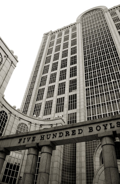
I didn't vote on this challenge, so I have nothing to compare this image to, but it sure looks good to me. Anyway, I have a feeling that one of the reasons it did not do better is because the foreground sign seemed to compress the photo, rather than stay with the wide angle idea. I especially like the curves of the building, and would have liked to see more of the right one as a balance to the left curve. |






 Add photograph to your favorites
 Add photographer to your favorites


 Photographer found comment helpful.