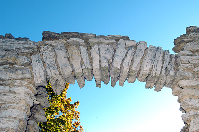
While I see the use of wide angle and it's a unique structure, I find it doesn't hold the visual appeal for me compared to others in the challenge. It looks a bit flat...or something. Sorry, I'm not very good on the technical critiques.
the white part on the bottom is some what distracting, i wouldhave used layers to get an even more bright blue
The rest of the image is also not that interestig,I am just being honest in my opinion, hope not to piss you off







 Add photograph to your favorites
 Add photographer to your favorites


 Photographer found comment helpful.


