*Critique Club*
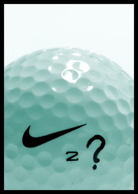
I like that even though we think that this shot would be overwhelmed with white, the shot isn't. It's got a blue tint, but it looks like it was done with lighting, or reflection of something blue, and not a post processing effect. That appeals to me.
The glare on the top of the ball is just a little distracting, but it adds character.
I don't follow golf at all, so I don't really know what the ? is for, maybe for "Can he do it or not?". I like how you have filled the entire bottom portion of the photo with the subject. I think it's quite nice this way. Visually appealing.
Focus and clarity are really great. Love the closeness and the texture of the ball.
~Heather~
PS Sorry if my comment is brief. The magazine cover shots are being taken off the CC list tonight, and I figured a shorter detailed crit is better than no crit at all.
I think you'd find that there'd be too many legal wrangles getting the nike swoosh on the front cover for them to use this shot. The concept/story link is a good idea though. 7.






 Add photograph to your favorites
 Add photographer to your favorites


 Photographer found comment helpful.


