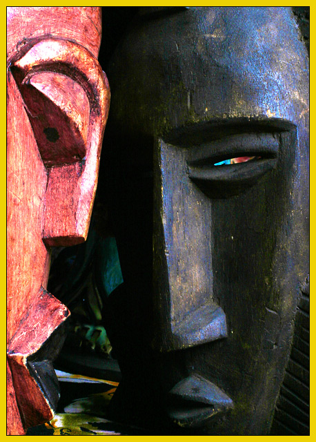
Finally! A National Geographic entry that actually LOOKS like a National Geographic cover. Great job. The color showing up behind the right eye is a little distrating but overall this is one of the better pictures for this challenge.
I like this. Seems as if extraneous color (inbetween the faces and in the eye of the black) could have been minimized the photo might have worked better, just the red and black masks.
Nicely done. I could definitely see this as the cover of National Geographic. :-) I think I would have liked it with a more solid background if possible. Whatever is behind it, seems kind of distracting to me... not horribly though. I kind of like the bright spot behind the one masks eye. The yellow for NG looks a little off but it's not a big deal. The lighting here is pretty good. Overall this is a solid photo... I'd like it better with a little less of a distracting background but it's still an 8 from me :-). Good luck!
great photo! i love the shadows and light and the crop is perfect! that littls bit of color behind the eye of the mask really sets the tone for the pic...it looks wicked! definitely a Nat. Geo. cover...well done!
First thing that struck me was how bright the left face is, which would make it harder to place copy across it (though not impossible); a different crop or angle might have helped with this.
As far as the magazine goes, I could see this on the cover, yes. It's interesting and ethnic-feeling.





 Add photograph to your favorites
 Add photographer to your favorites


 Photographer found comment helpful.


