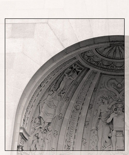
I love this one. It would be perfect for a cover photo. Beautiful choice and love the composition. Neat framing, too. Also nice in b/w. Maybe could have been a tad bit more sharp with a bit more contrast to the detail of the artwork. A beautiful 9.
Maybe use a little more Unsharp Mask on this. I don't know if I like the border for a magazine cover. Nice contrast between the light wall on the outside and the inner part.
Beautiful shot, and the cropping you chose makes it interesting. My eyes are pulled right off the page, makeing me feel like there is something bigger than what you have captured in your frame. I really like it.
I like this... looks very professional. Nicely done with the area at the top for text. I could definitely see this as the front of a magazine. Good luck.






 Add photograph to your favorites
 Add photographer to your favorites


 Photographer found comment helpful.


