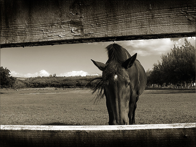
Like the image very much, especially its tonality, texture of the fence and it's use for framing, as well as, inclusion of the environs. I do, however, think it would have been better to not cut off the horse's nose and I wish the background sky was more interesting.
Very nice image...my daughters personal fav. Interesting composition choice for this challenge...but it is quite ingenious. Using the fence posts to give the image a natural wide crop...very ingenious indeed. a 9 from me =)
I like this shot. I'm not sure about the tilt though. I think it might look better either straight or with more tilt. This shot falls somewhere in between and looks as if it might or might not be intentional. I love the sepia tone.
Oh I like this peek at the horse through the fence slats. The leading line of the trees on the right is a nice touch as well. I wish his nose wasn't covered but horses don't "Sit and stay" like a dog. LOL Good one.





 Add photograph to your favorites
 Add photographer to your favorites


 Photographer found comment helpful.


