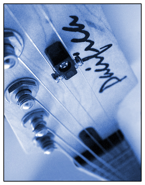
I really like this but it totally feels upside down to me. Scoring it an 8 but would be 9 if it were other way up - yes I appreciate that an editor would see past that and simply rotate it but I think it was a poor choice to present it upside down in this challenge.
I really like the depth of field here. The tones you\'ve used and the composition really make me want to read this magazine! I think the grain is very appropriate herre, adding a more natural, journalistic feel to the image.
I was photographing this guitar the other day, and never thought of this angle! I like the blue. Good lighting. The graininess suits this picture, but not sure if a grainy picture would be on a magazine cover. Nonetheless, 10.
Hmmm. Chosen angle is dynamic and interesting to look at. My eye shuns that bridge (?) piece on the last two strings. I think a more appropriate hue of color could have been chosen, more of a traditinal, darker sepia probably. We start to see some noise towards the bottom where the focus drops out. Diddnt really mark down for this, but right before the fretboard starts its especially noticable.
Maybe a bit much on the blur here, even given a focus on the tuning. Topically it seems apt. The toning seems a little strange. I think being able to read the logo more clearly might be nice; at that angle I have to twist my head. But it would depend partly on the focus of the cover story.







 Add photograph to your favorites
 Add photographer to your favorites


 Photographer found comment helpful.


