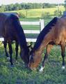
I was gona post another picture but when I saw the picture better she was all out of focus so this is my submit for these week challenge. Hope you like it.
Statistics
Place: 195 out of 232 Avg (all users): 4.4024 Avg (commenters): 5.1818 Avg (participants): 4.2397 Avg (non-participants): 4.5600 Views since voting: 1219 Votes: 246 Comments: 25 Favorites: 0
This is such an unassuming capture, much too small for any informed criticism or even to hold the attention of the average voter long enough to merit it.
The truth is, I 'like' this photo. The angular relative position of the horses against the rising hill in the background lends some composition to this pastoral idyll. The (camera) lens distorts the size of the (front) horse's head, which adds an element of humour. The light and colour tones appear very natural, apparently without anything having come between lens and the subject.
This shot looks to be somewhat distorted with the horses head too big in comparison with the rest of it's body. I do however, like the composition and arrangement of horses. Color could be more saturated.
This is so cute (I love horses!) I love how the one is in front of the other, it's like they were posing for you. Just absolutely darling. I would have liked to have seen this somewhat bigger, I'm sure you've gotten that a lot in your comments, but in case you don't know how to do this, if you have photoshop, when you move the dpi down to say 72, then put your pixels of your largest size to 640 (maximum) this will put it at full size. Hope that helps. I would have liked to have seen maybe slightly more room at the top for type, but it's not imperative. I can't tell if these little guys are in focus or not, but I'm guessing they are. Also there seems to be some kind of a film over the whole photo, kind of a greyness, maybe it was foggy? If not, play around with your levels and contrast. I really like this though, even with the faults I'm going to give it a -9- good luck!
Wish this photo could have been bigger! It's a very nice shot. I really like the composition. I would have liked to have seen more rolling hills in the background
This is such a lovely composition and the foreground horse seems great. The big problem is the image size: wayyy too small and it makes it hard to see the image and evaluate it. Please submit pics closer to the max size allowed, i.e. 640 px. You're hurting yourself scorewise with such small submissions.
My favorite subject however this image angle just doesn't do him justice. This angle shows a head too big for the body and bad front legs. I doubt it would be on a cover. The black pony in the background looks much better.





 Add photograph to your favorites
 Add photographer to your favorites


 Photographer found comment helpful.


