|
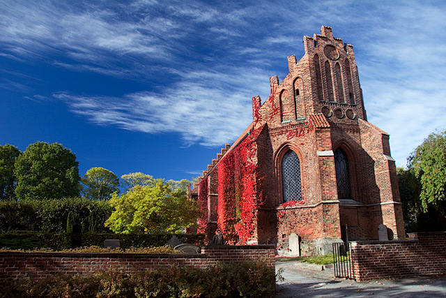
I like it ... and you KNOW how I like pictures of churches! I thought it was a touch oversaturated at first glance, then I realised that's what the colours really were (except for a bit of intensifying via the polarizing filter). Moving closer might accentuate the 'lean' of the building even more, but I'd have done it anyway & so got rid of the fence. I feel the horizontal line of the fence is a little graceless, and is fighting with the beautiful verticals of the church. Also, it looks like there are some gravestones hidden behind that fence, and they'd add a lot more atmosphere to the image than the fence does. Adjusting verticals in PS is not too hard, as long as you remember to just reduce the 'lean', and not eradicate it altogether (which looks unnatural & makes the building appear squat). For truly expert advice on correcting perspective in architectural subjects, send a PM to bear_music. Cheers! P. |




 Add photograph to your favorites
 Add photographer to your favorites


 Photographer found comment helpful.

