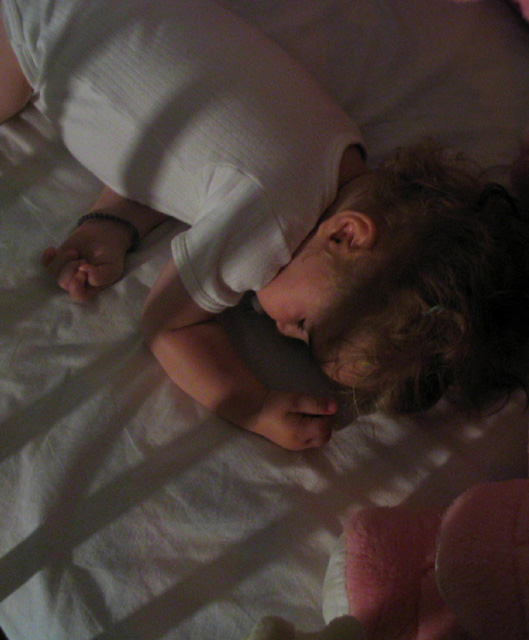
I was trying to find out what to photograph, I tried some shots with my wife, than with my dog and finally I was looking my little girl sleeping and I tried to make some shadow cast over her to make image more interesting.
Statistics
Place: 202 out of 232 Avg (all users): 4.2146 Avg (commenters): 4.1000 Avg (participants): 3.9426 Avg (non-participants): 4.5135 Views since voting: 2152 Votes: 233 Comments: 12 Favorites: 0
*Critique Club*
This is a precious photo, however, I don't think it would work very well on the front cover of a magazine. They usually use bright or flashy covers to draw attention to make you buy it. This shot turns out just a bit too dark for this.
Also, after the title is added, 1/2 your baby would be covered up, and only her little head sticking out from under the title, making the main part of the magazine showing her animal and bedding.
I do like the shadows. I'm glad that the one on her face doesn't go over her eyes. That would have been a disaster in my opinion.
The angle is a bit odd, and I wanted to see it with her at the bottom of the photo, with her head going towards the top, rather than this way around.
Focus and clarity seem ok. A little softness here is alright by me, because of the overall feel of the photo.
As a photo, I think it's excellent, but maybe not so good on a magazine cover.
Still really nice.
~Heather~
Don't they look peaceful when they sleep? While the subject certainly fits the magazine, I can't really see this on a magazine cover, sorry. The angle would make people try and turn the magazine on its head to see the pic the "right" way up (even though I'm pretty sure this is the way you took the photo), and it's overall a little dark and soft. It does allow for text to be added though which is also important. (3)
With a picture this dark it would work better in black & white. From there see if youcan salvage any more light with postshot adjustments... I like how the shadow from the bars come across the frame...
Seems kind of dark, but then I guess that's what you were trying to do, as she/he's sleeping. I'd like to see a little tighter crop, and not so close to the top of the head. Lovely child, great idea.
This is beautiful... maybe just slightly too dark, but it gives this a nice dreamy feel. I love the shadows that fall over the crib and the sleeping baby. The bottom area leaves room for words which is nice. I would have lightened this slightly but I think it's very well done. Good luck!





 Add photograph to your favorites
 Add photographer to your favorites

 Photographer found comment helpful.


