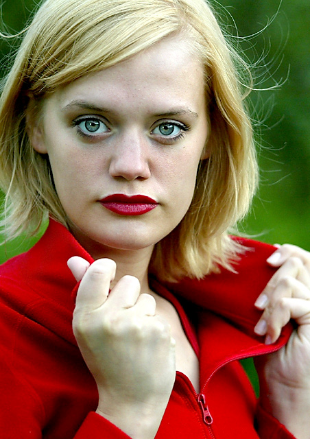
I took this one in my backyard with a 80-200mm L F/2.8 USM lense. I chose a red sweater because I had a green background. And green works well with red. I had a hard time choosing from the pictures I had taken. I used extra light to get some light on her right side of the face. You can see the lights reflection in her eyes.
I had fun with this challenge.
Statistics
Place: 101 out of 232 Avg (all users): 5.4835 Avg (commenters): 6.8500 Avg (participants): 5.3629 Avg (non-participants): 5.6102 Views since voting: 1774 Votes: 242 Comments: 24 Favorites: 0
The only thing that bugs me about this photo is the lipstick color. I would rather see a lighter color or a red, definitly not pink. She is very beautiful.
I've seen her in so many pix, but her eyes are still wonderful and stunning. Love the pose and the slight breeze through the hair, can absolutely see this on the cover of a magazine. Just some minor overexposure on the hands plus the lipstick clashes with her top! Those are nitpicks, this is great work, Arni. (9)
Arnit I hope you are starting to pay your model well :-) She is becoming very famous here on DPC! Excellent portrait, beautiful large dreamy eyes. Great DOF, yet again another 10 from me.
absolutely fabulous arnit--she is gorgeous, your photography is awesome and you, as usual, are my hero! :)
i love the contrast of red and green with her blonde hair--very striking and stunning. my only teeny nitpick--more for real life than anything--is being careful of mixing warm and cool shades of red--this lipstick looks great on her, but generally red lipsick is glamorous on its own and tends to be worn more with neutral colors to highlight the splash of color and the elegance the red brings. im still giving you a 10 because this shot is so wonderful, but had she a black or white shirt on i would have given you a 20! ;)
You have chosen a nice model for the picture. The red clothes combined with the red lipstick and work very well. There are some things which could be improved IMHO: the zipper is distracting and makes the picture quite ordinary. Also the skin tone is a little too white: 'warmer light' would improve this greatly.
On any glamour cover shot, I have to be strict. It's a very precise way they take the pictures. Lots of make-up. Over-expose. That's just how it's done. And usually, very very perfect lighting. This picture feels a little green, too. A nice attempt though.
i think i saw this picture already before the challenge. IMO hands are very white, but as this lady can be from Iceland, that's OK, but still I think you should use some powder to make less difference between her face & hand skin. = 5
Very good. One of the best fashion shots of the challenge, I think. Fantastic model who obviously knows what she's doing. Excellent choice in clothing, pose, background and make up (perhaps a bit more powder or something on the face to smoothing the complexion tones a bit?) Love those little wisps of hair floating off to the sides, also. 9
We've seen this girl before haven't we? Very nice portrait, well done. I think it fills the frame almost too much, and I'm not sure where you would put any type. This is kind of a problem for magazine. Also the hands lose a little bit of definition especially the far one... it's almost too bright.






 Add photograph to your favorites
 Add photographer to your favorites


 Photographer found comment helpful.


