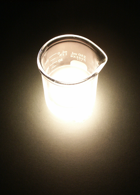
A measuring beaker lit from below
shot at the last minute just to have an entryit looks like a duo tone but is in fact full colour with no contrast or hue manipulation even though the backgroud was green?
Statistics
Place: 111 out of 232 Avg (all users): 5.4137 Avg (commenters): 6.2222 Avg (participants): 5.1463 Avg (non-participants): 5.6746 Views since voting: 1139 Votes: 249 Comments: 18 Favorites: 0
A neat photo with the beginnings of a really creative and excellent piece. I feel that the photo could have been alot more vibrant and 'mad-science' like if you had used a colored light source in the beaker instead (perhaps experimented with the glass and color effects).
Hmmmm... I like the concept, how the bottom of the jar fades into a perfect brightness. However I dont like how the printing is backwards, instinctually I need those numbers and words to be on the frontside so it doesnt 'bother' me.
The light on this is awfully bright/glare-y - I assume that's deliberate, but it doesn't seem to fit in, and I'm not sure what it's supposed to tell me. With the high angle on (beaker?), it also is too tall an image, with the bottom part sort of dragging on and leaving it feeling imbalanced. Cropping it at the bottom edge of the glare (taking a distance off the bottom about equial to the distance between the right edge of the photo and the right edge of the beaker) seems to balance it out a bit more.
Topically the photograph is fine, I can easily see this on New Scientist with the right article. I think you would have been better off with not quite so bright of lighting glow. The fade on the light would also have been softer which would help the compositor. The sharp focus on the top edge of the focus is good but it loses some at the bottom edge of the rim because of the lighting as well.
too much contrast on the bottom of the subject. contrast too high, details lost making the photo not very catchy. However, as a magazine cover, this is good.





 Add photograph to your favorites
 Add photographer to your favorites


 Photographer found comment helpful.


