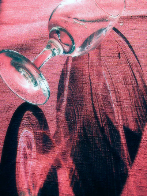
please forgive the bluntness of this comment, I'm a bit tired, but want to comment on the pictures I'm voting on. I like this skewed shadow on a textured background, reminds me of a picture mavrik took for one of the challenges, glass maybe. My nits are the dirty parts of the background and that the glass and shadow are both cut off.
Very nice effect. My problem is, there isn't any food or wine in the photo. Maybe they have done this on rare occasions, but usually there is always one or the other on their cover.
This is a pretty neat picture. I'm not clear on how it meets the challenge. The title magazine wouldn't post a picture of the front with an empty glass and no food or wine, imho.
The picture itself is interesting though. Good texure, color, and composition.
I like the concept. Ttechnically you have done well. But it feels very unbalanced to me.
Perhaps a longer shot (more of a slice of a picnic scene) would have been more usefull as a 'cover'.
In terms of topic to magazine: I don't know your magazine well but I'd be inclined to think they'd want a less arty shot or at least an arty shot that had wine actually in it.
In terms of shot: I'd love to have seen the shot focus on the shadow and refraction and include far less of the glass; against that background that's just a cool effect. With the glass, it's less effective. Lighting at the top is also very bright.
In terms of layout & design: You might have some trouble putting copy across portions of this but you probably could manage it. If this is a shot for a full-bleed cover the crop is good as is, too.
This is kind of cool, but I'm not sure that it would be used for a food and wine magazine. I just don't see any food or wine on it, although there is a wine glass, I just don't think it's the right thing. Also I'm not sure where you would put the type, I just don't think it works for the theme. Sorry bout that.





 Add photograph to your favorites
 Add photographer to your favorites

 Photographer found comment helpful.


