*Critique Club*
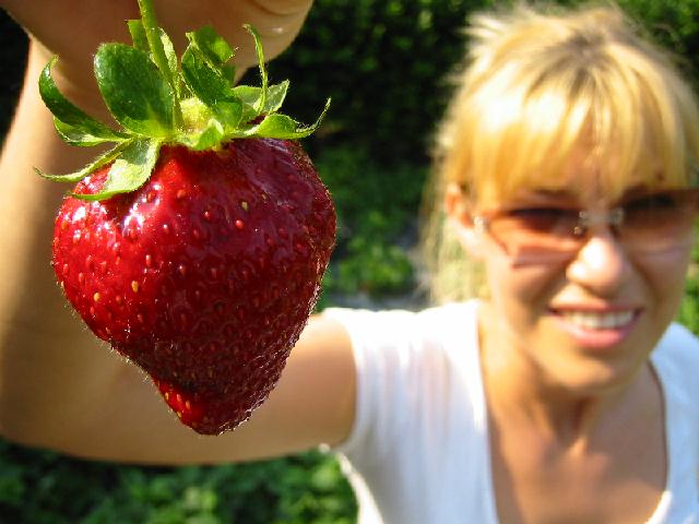
The background for this image is Quite pixellated. The focus and quality of the strawberry is good, but the quality of the background is really really poor. See all the little identifiable squares in it? Especially on the face.
There are a few hot spots of lighting. On the nose, hair and shirt. I think that the shadow on the strawberry is making it look like it's a little old. Maybe starting to go soft.
Overall angle and framing/cropping are good. I like the DOF, and think that it's used realy well here.
If I had a suggestion, for the challenge, it would be to have moved the strawberry nearer to the person, and get a vertical crop, so it would be more formatted for the front of a magazine.
Nice idea.
~Heather~
*Final Hours Critique*
If my comment is brief, it's because the Magazine Cover shots are going to be taken off the CC list tonight at midnight, and I can get to more of them, using less words. Figured even a brief comment is better than no comment at all.
how would you go about putting this on a magazine? the two photographical elements are split in half you can have the strawberrry on the front and have the girl on the innerspread, which would you do?
Not a bad macro. Need a little fill flash on this one. Strawberry's a little dark. I would've put the berry a little closer to the woman though, especially to preserve a portrait aspect ratio. Strawberry is very well focused, just a little dark
I'm dubious of the existence of your magazine, which google does not seem to believe exists as a magazine.
I cannot imagine this picture on the cover of a magazine. The strawberry by itself in its epic proportion, maybe. A person holding up the strawberry if she were in focus, maybe. The combination does not work.
Personally I do not consider magazines to be in a horizontal shape... thats just me though. Is this an actual magazine? I couldn't find it online... what kind of things are in it? I guess even with that name it doesn't have a picture of a person smiling with a strawberry every month/week/quarter does it? That strawberry kind of doesn't look too good, it looks pretty old and not so pretty, I wouldn't expect to see it on the cover of a magazine. I like your DOF though.
An interesting photo but doesn't look like a magazine cover. The shadow side of the strawberry seems a little too dark to me. Instead of it being the focus as it should, my eye is drawn more to the woman holding it than to the fruit itself.





 Add photograph to your favorites
 Add photographer to your favorites


