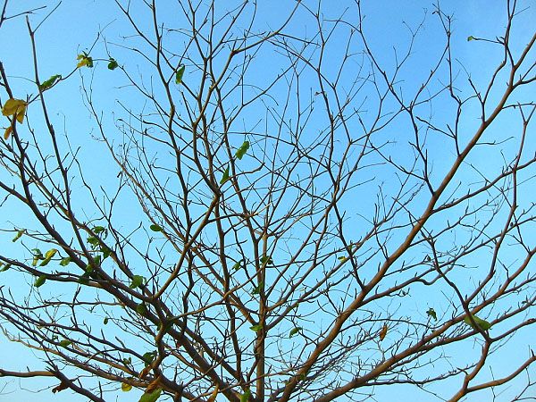
Feels a little too sparse to be on the cover of Nature Magazine. On it's own it's not a bad shot, there just isn't much going on; my eyes aren't drawn to any particular place in the picture.
The photo lacks a central theme to it (other than being a picture of a tree). Perhaps focusing on a particular aspect of the tree would give it a stronger feel to it.
Hmmm. Dont like how the tree is totally cropped out of the photo. Get a lot more, if not all, of it in the fame next time. There's not much of interest here for potential viewers, except maybe the fractal-like pattern of the branches. Nevertheless, I think this could have been shown bettern in other ways.







 Add photograph to your favorites
 Add photographer to your favorites


 Photographer found comment helpful.


