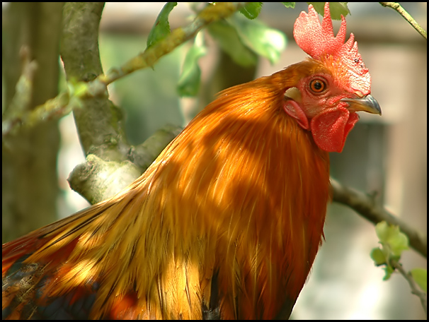
Never thought I'd have to rate a chook, but the tones in this image are beautiful in presentation, but I would have liked more rooster and I hope this isn't a hen. Really nice image.
This is an excellent photo. The focus is perfect with great DOF. The rooster is a beautiful color and nicely detailed. Only drawback is the shadows of the tree limbs on the bird. 10 Side note: I'm not entirely sure if this is really appropriate for the name of your magazine...LOL...I would think "Farm Bird's Life" maybe. My mom was a bird watcher but I don't think she went around farms identifying roosters. Still a 10, though cause I'm voting on the quality of the picture.
Great color and composition. I really like this image, particularly how the main subject starts at the lower roght, but the eye is almost perfectly placed in the upper right intersection point according to the rule of thirds. Well done.
Excellent colours, dof is brillian!! I love the choice of subject and it would certainly be a wonderful cover of a mag. I also love the shadow effect on the bird. Nicely composed as well. GL in this weeks challenge.
I find it hard to imagine a chicken on a magazine about birding, but it's a gorgeous shot - the framing, the background, the lighting are all just perfect. (If the rooster we had when I was a kid was looking like that, however, he'd have been pecking the camera and photographer very shortly after.... :)
Hmm... well, I see "birder's world" and for some reason I think of birdwatching -- no clue about the magazine itself. And I don't think of roosters as terribly bird-watching material.
Assuming a NON-full-bleed magazine, it'd be a good shot; focus clear on the bird, background not intrusive. In a full-bleed, you'd have some problems with the brightness of the colours vs copy text, but it might be manageable.
well, in honesty this is not my favorite type of bird, but I certainly can't argue with the clarity and sharpness and lighting of this shot. Very nice, and you 'caught it' mid peck.





 Add photograph to your favorites
 Add photographer to your favorites


 Photographer found comment helpful.


