| Author | Thread |
|
|
06/18/2003 06:00:30 AM |
Sorry this didn't rank more highly.
I read your detail and curious what you mean when you say phone.
Do you mean photo?
:D
Anyway, nice pic! |
|
 Photographer found comment helpful. Photographer found comment helpful. |
Comments Made During the Challenge  |
|
|
06/17/2003 10:19:57 AM |
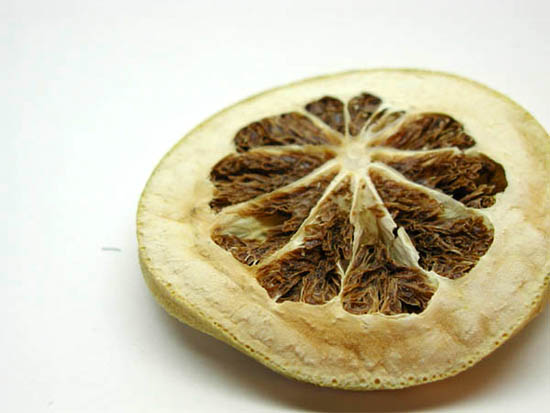
Strangely attractive for a dried up slice of fruit ;)
I like decision to use white space and off centre composition but it's not quite there for me - I think perhaps a little more white space to the left and either more or no cropping of the slice of fruit.
8 |
|
| Photographer found comment helpful. |
|
|
06/16/2003 04:57:47 PM |
|
Simple is right! The sparseness works well. Interesting choice to have a dried fruit rather than a succulent, juicy one. May be good for a harvest/food preservation issue! Anyway, good composition and use of light. |
|
| Photographer found comment helpful. |
|
|
06/16/2003 11:43:26 AM |
|
Personally I do not consider magazines to be in a horizontal shape... thats just me though. It's a pity that you didn't make this a vertical photo... I think you prolly would have scored a lot higher than you are because voters wanted vertical photos. This is nice... I could definitely see it on the front of said magazine? How did you do the lemon (?) Interesting... good texture, good lighting |
|
| Photographer found comment helpful. |
|
|
06/15/2003 06:13:43 PM |
|
| Photographer found comment helpful. |
|
|
06/14/2003 12:01:15 AM |
|
I checked out some picture from this magaine online and came to the conclusion that, although it looks nice, a larger depth of field may have really helped. Just my opinion. |
|
| Photographer found comment helpful. |
|
|
06/13/2003 12:43:50 AM |
|
Never heard of this magazine. |
|
|
|
06/12/2003 06:44:39 PM |
|
Its a very good photo (though a bit less than appealing), but I don\'t get it. I\'ve never heard of Real Simple mag and I\'m not coming up with any mag title that would put this on their cover (Maybe a fruit drying mag?) The layout doesn\'t seem to lend itself to a cover shot, too (but I\'m not really scoring that issue). 4 Rob the Swash |
|
|
|
06/11/2003 01:07:56 PM |
|
Absolutely beautiful. If we were allowed, I'd clone out that little imperfection just to the left of the subject. But wonderful, clean, whites and beautiful color tones. 8 |
|
| Photographer found comment helpful. |
|
|
06/11/2003 09:40:50 AM |
i am familiar with this magazine and i really don't see this picture on the cover of it, sorry... technically, with the white background like this i'd expect to see more of the dof, the cropped off right side doesn't make sense in this context, and the subject does not appeal to me... 1
|
|
| Photographer found comment helpful. |
|
|
06/11/2003 08:34:43 AM |
|
Probably be better with less lighting and shaoolower DOF (= much lower score on DPC). |
|
| Photographer found comment helpful. |
Theme:
Classic /
Light /
Dark
Home -
Challenges -
Community -
League -
Photos -
Cameras -
Lenses -
Learn -
Help -
Terms of Use -
Privacy -
Top ^
DPChallenge, and website content and design, Copyright © 2001-2026 Challenging Technologies, LLC.
All digital photo copyrights belong to the photographers and may not be used without permission.
Current Server Time: 10/13/2026 12:37:25 AM EDT.







 Add photograph to your favorites
 Add photographer to your favorites


