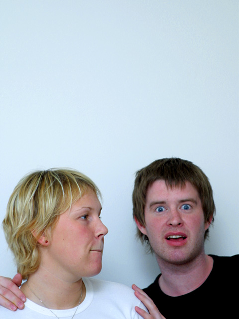
Couldn't find anything on this magazine with a quick surf on the internet, so I don't know how appropriate this is for a cover photo. Based on other magazines I've seen, I would expect this to be an acceptable photo only if the people are celebrities. (3)
I like the format you've chosen and the space you left for text, but she's more in focus than he is and they are both making goofy faces which is not typical for what you see ... good photo for those that know them, not as interesting to others ...
Hmmmm... I'm not sure my decision on this photo... I guess it could fit the said magazine, but I'm just not sure it's particularly attractive or something that really catches the eye. Not sure, but I think there is much too much blank space.







 Add photograph to your favorites
 Add photographer to your favorites


 Photographer found comment helpful.


