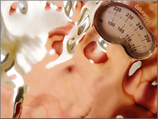
...i thought about despeckling the surface of the scale, but i like the additional streaks and flaws in this picture--adds to the distorted body image idea.
my rinky-dink plastic bathroom scale and me! (i really don't have one of my breasts coming out of my stomach. really!)
edit: check carefully to ensure that camera was not in picture, levels, curves, slight crop, saturation, curves, scale, border, and a bit more levels & curves after initially posting here.
...and regardless of how this scores (i can see this image going both ways on this site), i love it. besides, my boyfriend stood for several moments looking at this, then said "it gorgeous." and he never says that about anything, so that's good enough for me!
(well...) ; )
(...and now that the results are in...)
lessons learned:
my tastes are decidedly different from those of the general dpc crowd.
would have liked to see lighting that helped make this pop more...especially up by the scale reading.
i think people have a harder time with abstracts...keep this in mind for future submissions.
Statistics
Place: 147 out of 371 Avg (all users): 5.3321 Avg (commenters): 6.7778 Avg (participants): 5.0619 Avg (non-participants): 5.5253 Views since voting: 3209 Views during voting: 430 Votes: 271 Comments: 24 Favorites: 2 (view)
Great photo. I'm a big fan of abstract photography...and it usually doesn't fair that well on this site, but I'm going to keep posting them! So rock on!
I was one of 65 5's you recieved. Due to the staggering partication in this challenge, I didn't have time to get back to my 5's, I start from the ends and rejudge toward the middle. Your concept was near brillant and well done. I think the fact that you skewed the scale reading to focus on that segment of the population which tends toward dysmorphic body concepts makes it more effective. The little touches do help. I wish I had scored it better now. Highlighting the scale face would have meant dis-assembly and installing lights under the scale frame.
I loved it and gave it a 9 during voting, I don't think you should get too wrapped up in your score if it is a shot you really like, take photo's for yourself and if others like them thats great if they don't you still like it.
I gave you an 8, if I had time to re-evaluate I would have upped you to a 9. I have noticed that people on this site have a decidedly dry sense of humor; it's refreshing that yours isn't.
I think this is a very nice entry. I think it should have done a little better then it did... maybe a 5.6-5.8. I did not vote in this challenge, but probably would have give you a 7. You're right that abstracts are a hard sell here, but I have found they are hard to sell at most of the "challenge" sites. Balancing the light is also a good idea. The first thing my eye is drawn to is the bright spot in the top left. Otherwise, I like it. :-)
In response to your request for feedback, I couldn't really make out what this pink thing was in the reflection. I kinda thought it looked like some strawberries in melted ice cream. I like the sharpness of the digital reading compared to the softness of the reflection. I gave you a 5 for aesthetic value. Would have scored higher if I could have figured out what it was.
I very much like the originality of this photo. Your eyes wander successfuly and yet elusively around the photo trying to decipher a human form of sorts! well done and the composition is great!




 Add photograph to your favorites
 Add photographer to your favorites

 Photographer found comment helpful.


