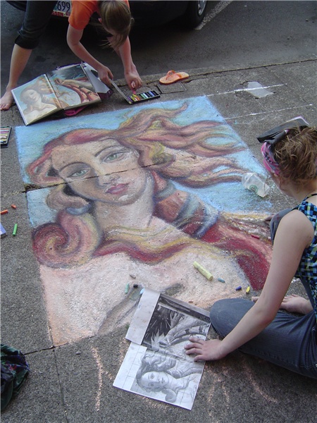
Niocely composed image. Good angle. Showing artists at work would make a nice cover for your magazine.
Meeting this challenge means that you image would match the quality and feel of the real magazine's cover. Yours does. I'm sure they would be proud to have this image on their cover.
Wow! Those two are quite talented... I like this photo... it shows "local" art which is kind of fun. I'm not sure where you would put the type on the magazine... but I guess you could ddo a top or bottom border? I think I would have liked brighter colors maybe... Great composition here... everything keeps you in the photo.
Very cool! Both the chalk artists and your capture of their work. I like seeing the views they are working from, plus showing the artist(s). Color seems a tad pale, but pretty good. Focus is strong. (Never heard of your mag title, but I'm just going to assume this could work with a number of art mags, O.K?) 9 Rob the Swash





 Add photograph to your favorites
 Add photographer to your favorites


 Photographer found comment helpful.


