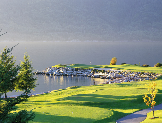
The greens really stand out in this photo but sadly to say the rest of the photo just isn't there. Luckily for you the greens are your main focal point but the greens are so bright that it makes you wonder why the haze over the background. I can't help but wonder if it is a humid haze or a fog coming off the water. Possibly photographing this at a different time of day or an overcast day may have given you a different outcome.
In all this is a very pleasing image and it does meet the challenge. Nicely done.
Haven't heard of your magazine but I know there are golfer mags out there so I'm cool with that.
It's a pretty landscape shot that is a little less obviously a golf course than I would have chosen, but the flag in the background does give it context (and of course it would have a different context once cover copy was added). The shot is crisp and clean, it shows off what would probably be a challenging part of a course, from what little I know of golf. The focal blur on the background gives plenty of space for cover copy, as does the reasonable homogenity of the grass. A crop would not ruin it in the case of a full-bleed image. Overall a good job, however little I like golf. :)
Personally I do not consider magazines to be in a horizontal shape... thats just me though. This is a cool photo though, and I could definitely see it as the front of a magazine if it were oriented differently. This is one of the better landscape shots however. This looks like a beautiful golf course.
Definitely a beautiful shot... I especially like the sharp lighting on the greens with the soft, misty scenery in the distance. While it's not necessarily a factor in my evaluation, I'm afraid the portrait vs. landscape orientation issue may cost you points.






 Add photograph to your favorites
 Add photographer to your favorites


