Love the concept. I don't quite get the sense of the digital taking over. The title gives me the sense of something stronger. The photo feels like “digital in the forefront.” Still made me shed a tear for film though.
Very Good: the images are simple and convey a "message." The only draw back is the position of the objects: they need to be in lower right of image to leave room for magazine title at top and article list in side bar at left.
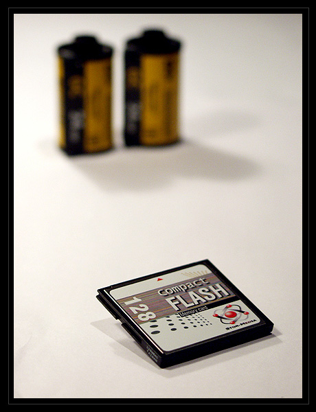
Excellent, I would like to see the film case a bit closer, too much white space between subjects. I like the concept and the lack of clutter very much.
great DOF, I wish there was a little more colour going on though, or maybe its just the heaviness of the border, which I think really takes it away from what ought to be an a magazine cover.
I like the way you propped up the CF card... I think it looks a lot better that way than just lying flat. I'm not sure I care for the way that the film canisters are soo far back in the photo... I guess there is a little too much empty space for my taste. I also have to wonder why you picked to put them so far back, that I'm not sure where the type would go. This is a nice photo, but I think it could be improved for a magazine cover. Thats just me though.
Great idea. I think you could've really got a little more creative and got some more color involved. The concept is very very good. It's not a bad photo, but it needs a little more bite
good use of rule of thirds. and having ONLY the subject in focus, instead of the entire image. I can tell you know a bit about photography. Good compostion as well.
Good idea. I think there's too much space between the CF card and the film for a mag. cover.... The CF card should be even MORE dominant then it is, and the film rolls a little less blurry.
*laughs* A lovely choice of subject for a digital photo challenge. I like the way you balance the photo, and also the tight focus that makes the film look blurred, 'phasing out' in more than one sense. Good one!
Great concept, but to work as a magazine cover, you might have to rethink your placement of the rolls of film in proximity to the disk. I know it may seem like I'm being too picky, but when I look at the shot, the first thing I'm thinking of is "would this work as a magazine cover?" Once you add the words that appear on any magazine cover, it might not work as it is. However, I do like the shot a lot, especially since you created something that fits neatly into your article title.
while i understand the DOF creates a very good effect in this shot, i feel it would be much nicer if the films and the CF card are nearer, or at least looks near in the photo. 6






 Add photograph to your favorites
 Add photographer to your favorites


 Photographer found comment helpful.


