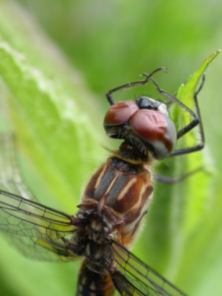
The composition and subject are great for a "National Wildlife" magazine, enough interest, yet still room for text to be added, and in a format that typically reflects magazines. However, as both a magazine cover and a photo, you are really being let down by the lack of focus and sharpness. This needs to be really crisp for this kind of photo to work ... did you maybe get closer than your camera could properly focus (I know I do that way too often). I do like the crop. (2)
I love the macro, but this shot seems to not be in focus. I can't tell which part was meant to be the centre of focus here, and that detracts from the shot, sadly. I like the colours and composition though, good choices!
Hmm, assuming a special on bugs, okay, that makes sense with the title. I don't know your magazine well enough to judge how likely this is, so I'll leave it be.
It's an interesting close-up, though I'm not sure I would have chosen to crop so much of the wings out. The focus is fairly good, seems to blur a bit more at the bottom than I think ideal. The crop is very good to account for cover copy and logo, and the focal blur helps with that. Maybe just a -touch- on the bright side.
Nothing really looks completely in focus here. It's kind of bothersome and out of focus. Interesting, and I like the fact you left room at the top for type, but I'm just not sure the photo is fabulous. Very nice job getting so close though!
if you had used a slightly deeper dof to capture more of the body sharply, this would have been a magnificent shot. Even the leaf could afford to be sharper, I feel.





 Add photograph to your favorites
 Add photographer to your favorites


 Photographer found comment helpful.


