Challenge:Magazine Cover (Classic Editing) Camera:Canon EOS-10D Location: Lake Balboa Park Date: Jun 8, 2003 Aperture: f/8 ISO: 100 Shutter: 1/350 Date Uploaded: Jun 9, 2003
i would like to see the shot taken from a lower view point. it looks as if the shot has been cut off at the bottom. sorry to be critical, its just my opinion.
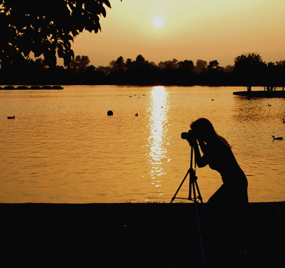
Wonderful photo... love the female silhouette. Her hair works especially well. Not sure about the placement of the sun just off-centre here. Dead-on centre or to one side would have worked better for me. The ducks are a little distracting as well. Love the foreground leaves. 9
Nice idea - one of the main problems I find with sunset shots is that there is seldom a really striking focal point - clever idea to make yours tie in to the title so well. I'd prefer that I couldn't see the tripod leg - kind of loses the silhouette effect a little - but that's a minor point.
I prefer this in portrait - cropping a lot from the left and just a little from the right.
A neat idea with some great sillouettes (okay, so I can't spell). One suggestion I have is to try composing the photographer (in the photo) closer to the other major elements in the photo so that she (I'm assuming it's a her) is a more prominent aspect of the photo.
The silhouette effect is damaged by the glow on the tripod. There's a bit of banding on the sky too. I think a closer crop on the photographer from a different angle, bringing in the sun and water would have looked better.
I like it. :) Having the photographer as a sillhouette (sp?) was a great idea. To me, it shows the photographer but more than that, it helps to highlight what the photographer is photographing. Very cool.







 Add photograph to your favorites
 Add photographer to your favorites


 Photographer found comment helpful.


