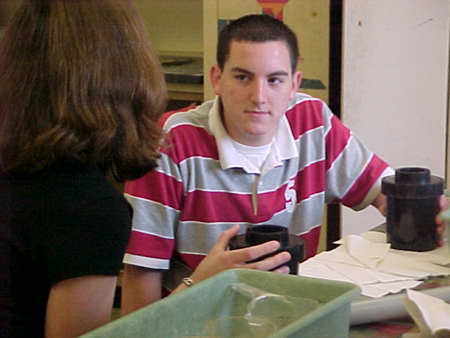
I think I get the idea, these two are learning about developing, right? No enough information to tell the story completely. It might have been nice to see both faces. Somewhat grainy - loses some of the definition. Color seems pretty good. 6 Rob the Swash
Too blurry. It would have been nice to see both of their faces - perhaps a different perspective on the shot would have worked better for me. Also, little items like the scratch on the door are distracting.
It doesn't feel like a magazine cover photo. It's not very eye-catching and it feels too cluttered for this challenge concept. Instead of telling me this magazine is about Photography, my attention is drawn more to the guy's rugby shirt since it's really the only vivid color in the shot.






 Add photograph to your favorites
 Add photographer to your favorites


